I've always admired people who have a great on-stage presence. The ability to masterfully deliver a presentation, speaking to crowds of people without a single brainfart amazes me.
But no matter how good of a speaker you are, if you don't have a good deck to present with, you're going to have to rely on your presentation skills alone and my experience the wrapping is often just as important as the content of the box.
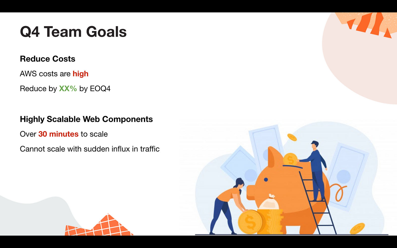
In this article, we're going to take the following use case: I need to present my team's goals for Q4 which are (1) reducing Amazon Webservices costs for our components/features and (2) ensuring that my teams' components are highly scalable
---
Color Palette
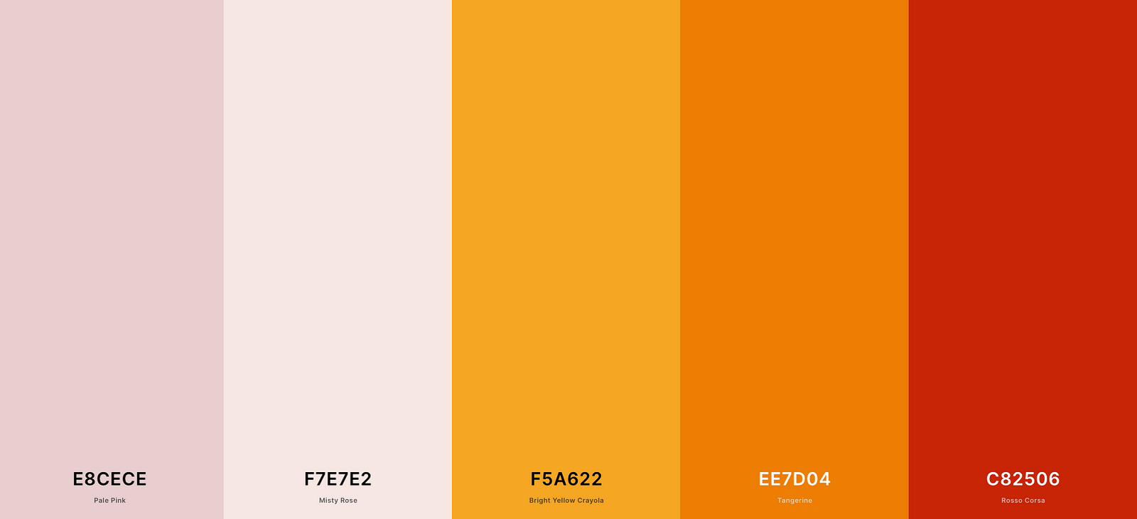
This is just as difficult a decision as choosing your next car. If you don't have a keen eye for design or aesthetics, there are plenty of tools out there to help you.
An ideal color palette should have no more than 3 primary colors (and even that might be much) with 2-3 very light shades for decorating.
My favorite resource for color palettes is coolors.co. You can even upload your company's logo or screenshot of a website and it will extract the most popular colors for you.
Another source of inspiration is Dribble, where you can see the color palettes used for any given design that strikes your fancy.
!Designing a Captivating Presentation color palette
'Blobs' Your Uncle
Weird shapes & wavy disproportionate circles are all the rage right now. You've probably seem them popping up like mushrooms on most of your favorite websites.
They're a great filler for presentations and add a touch of color to an otherwise dull page.
Freepik has some great shapes you can download for free and if you're *really* feeling inspired Blobmaker will let you create your own!
Remember: Only add these to areas where you don't expect to place your text and always use between 2-3 different shapes and colors on top of each other. No more and no less!

A Picture Is Worth A 1000 Words
Great graphics have the ability to re-engage your audience as they drift off throughout your presentation -- and you can confidently assume that some if not all of your audience is going to do this.
I especially like to use images which are indirectly related to the topic at hand so that the audience is left picking their brains as to how it connects to whatever it is I'm talking about.
Below are a few examples of topics and images which are connected. You might find some of these images too informal, but that really depends on your audience & the content of your presentation.
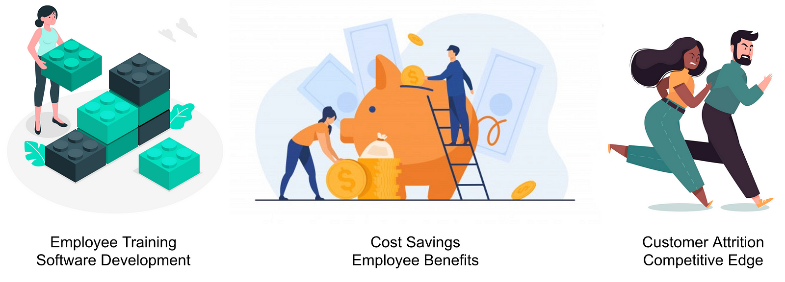
Freepik is a fantastic resource for such images -- probably the best resource out there today.
Icons8 has themed vector illustrations for download. Some of them are a little quirky, but you might find a themed package that can follow you throughout your presentation.
The image should be big and take up at least 25% of the space available on your slide.

Font Faces & Size
There are a few rules here, but they are all simple:
- . Use sans-serif fonts -- Serif fonts in my opinion are too formal, outdated and are best reserved for print. Learn more about what serif fonts are [here](https://www.lifewire.com/serif-font-information-1073831#:~:text=In%20typography%2C%20a%20serif%20is,horizontal%20strokes%20of%20some%20letters.&text=The%20term%20%22serif%20fonts%22%20refers,been%20around%20for%20many%20years.).
- . No cursive or handwritten fonts -- These tend to be a little difficult for some readers to scan at a glance and might make your presentation feel kitsch.
- . Don't mix fonts -- Stick with one font throughout your presentation.
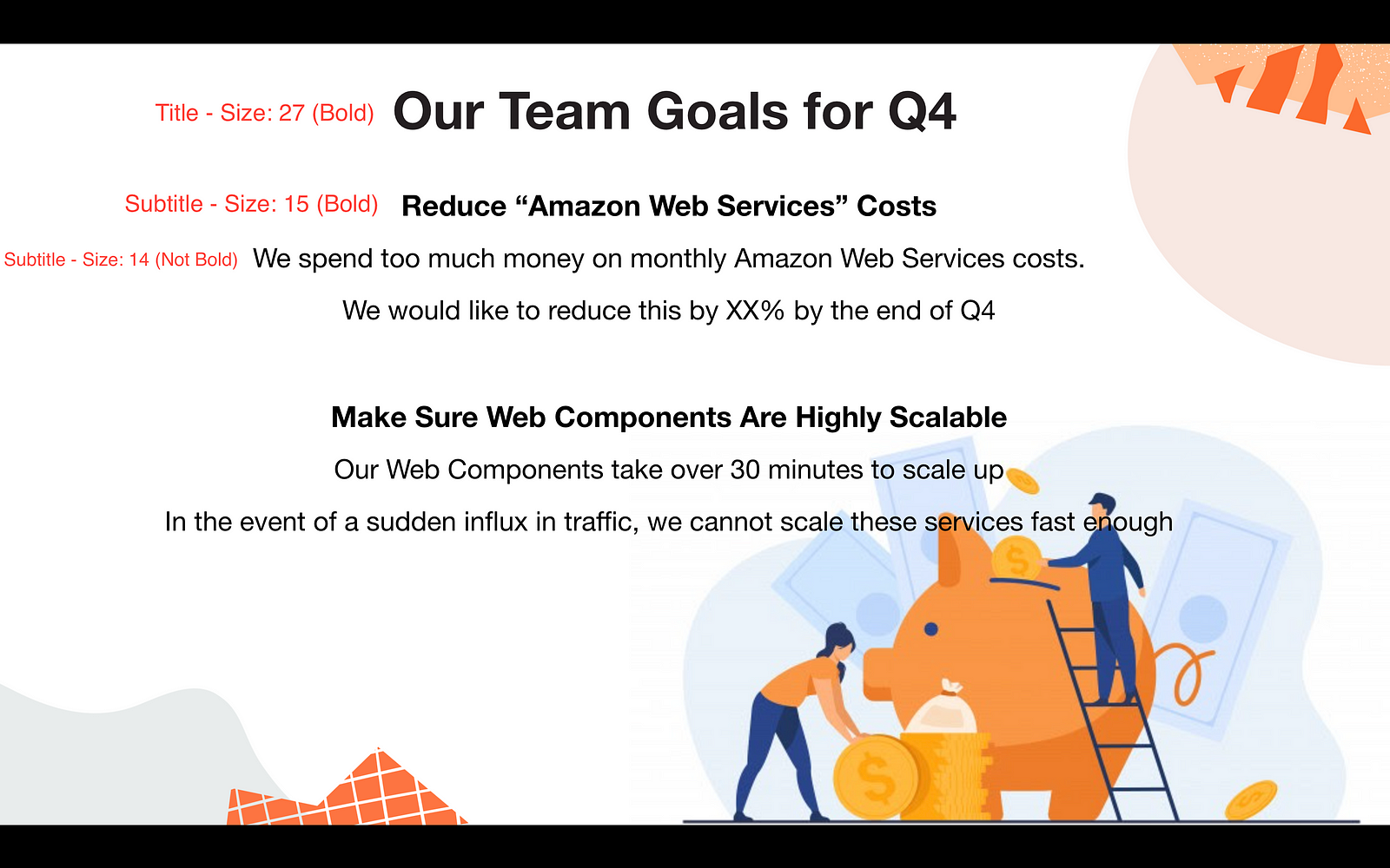
- . No more than 3 font sizes -- I usually reserve one for the slide's title, another for the subtitle and finally one for the text where only the last one is ***not*** bold.
Layouts & Alignment
I am drawn to poorly aligned text like a red rag to a bull. In the previous example, it is clear that we have some problems:
- . Text is overflowing onto the image
- . There's too much empty real estate on the bottom-left
- . The two 'paragraphs' are not identical in symmetry
- . Centered text clashes with the image positioning
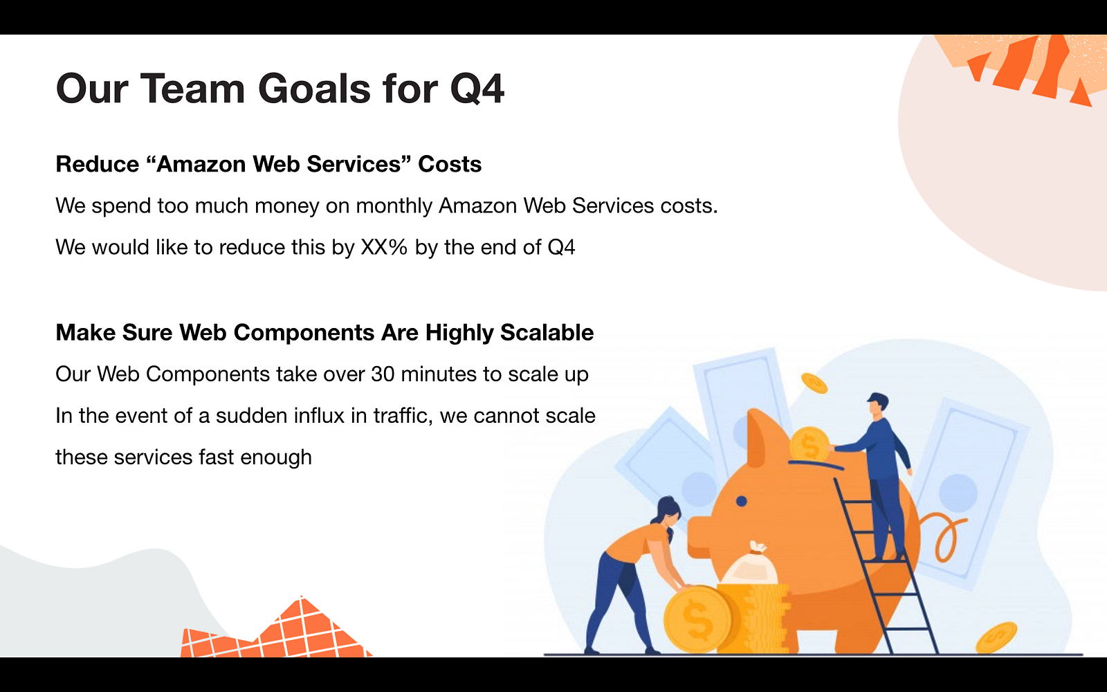
Layouting and alignment are here to help us. By aligning everything to the left we eliminate all of these problems.
Keep It Simple
This is probably the most important step of all. People tend to pour too much text into a presentation in fear of forgetting to mention something important.
There's a reason it's called "delivering" a presentation and not "reading" one. People are here to listen to you deliver -- Don't end up reading them a bedtime story.
Scrutinise each line meticulously and remove every word that adds no additional value to the coherence of the sentence.

Highlight The Gist
Highlight key words that are either important or will jog your memory to allow you to elaborate.
Red implies negative/bad facts/results Green implies positive/good facts/results Yellow implies neutral facts/results
---
In Summary
Let's face it, delivering presentations is not easy. In fact, any public speaking event is difficult the first few times. Try not to sweat it, or at least walk into your next presentation with your head held high knowing that you have an amazing slideshow planned for everyone!